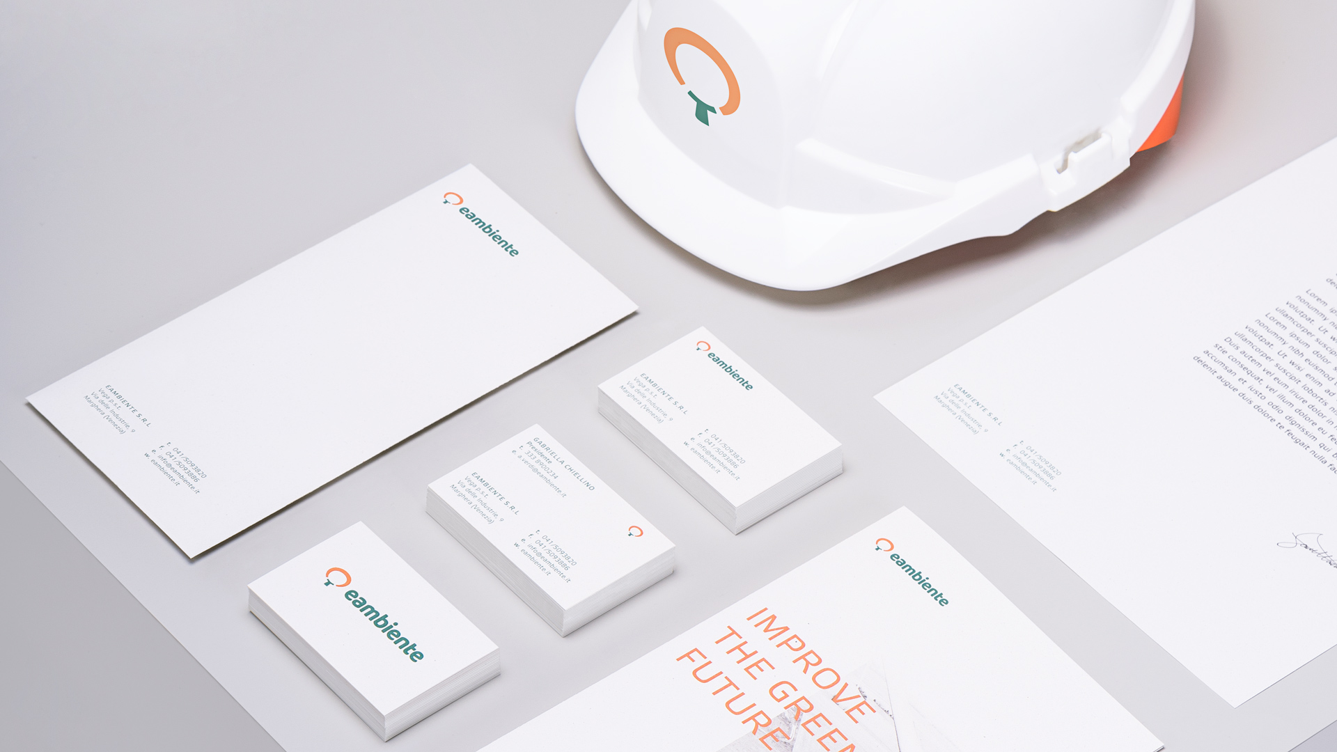
Eambiente
Pushing transitions
Born in the nineties, Eambiente is an Italian company pioneering in sustainability services. We equip them with a contemporary identity to empower their strong beliefs.

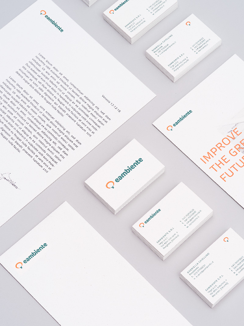
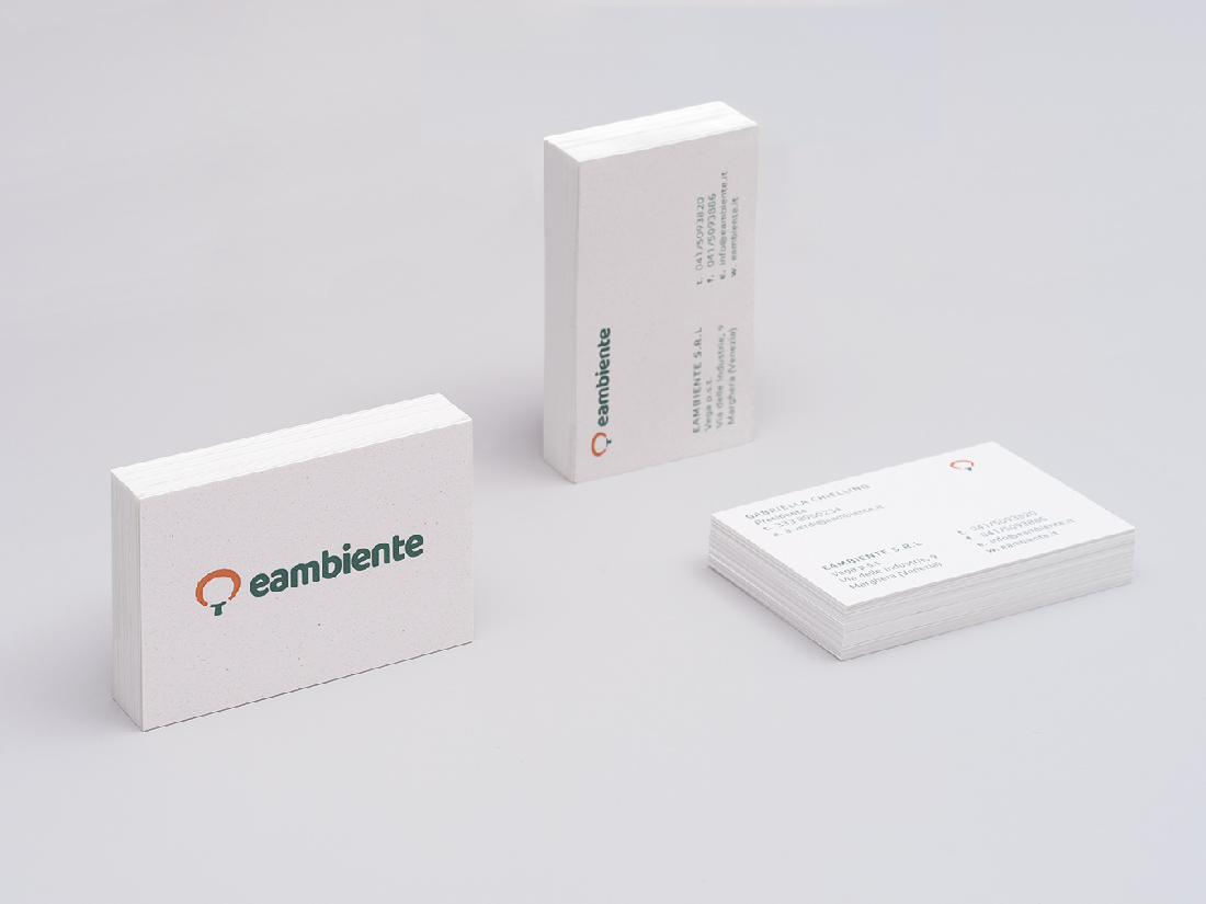
The logo portrays a tree that grows in the Amazon region. It's a strong link with their charity missions. Now it has a brand new look that preserves its deep essence.
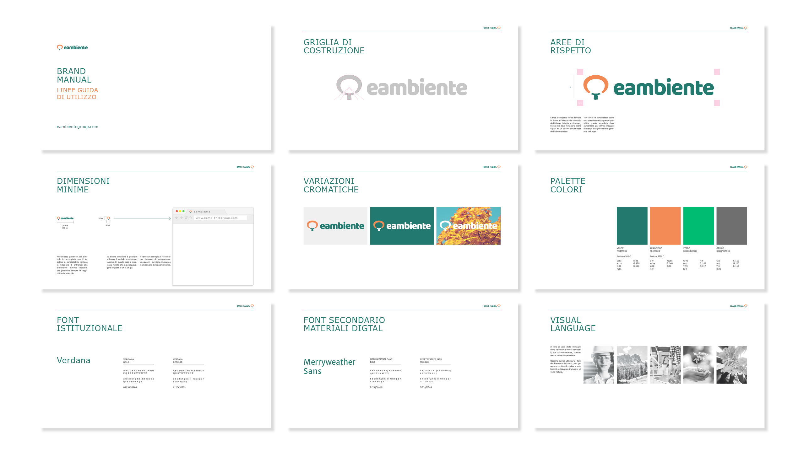
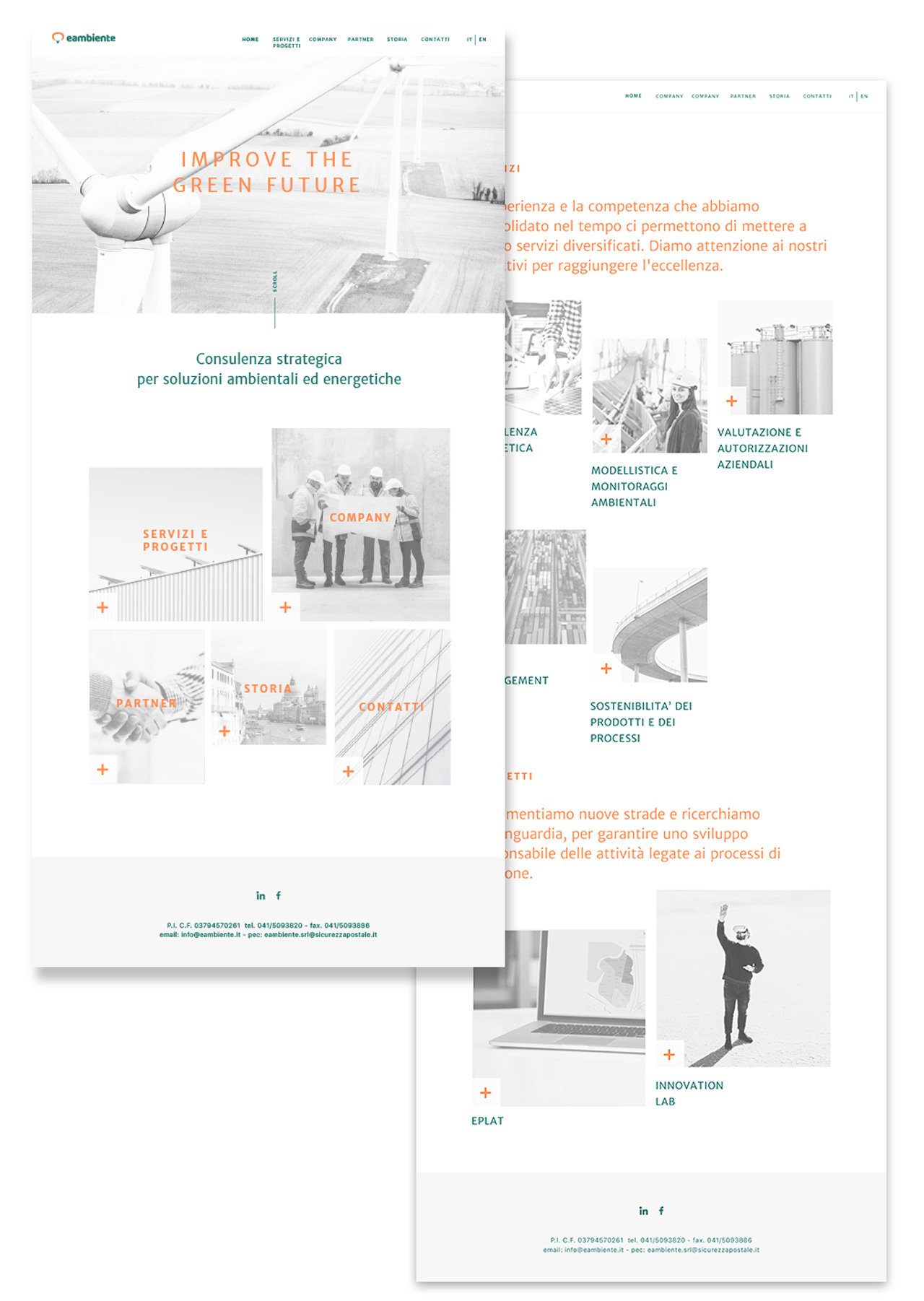
Black and white images with strong overexposure introduce a bold tone of voice. More white means less ink, a trigger that adds visual consistency while showing a real commitment.
TYPE:
Brand design
YEAR:
2017
CREDITS:
Abc Production +
