Studio Triggiani
As simple as possible
Studio Triggiani is an osteopath practice that was looking for a new identity and a consistent website renovation.


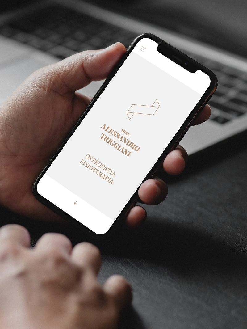
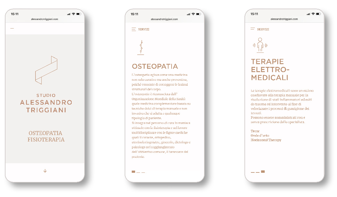
A pure mark, influenced by a spine shape, relaxing colours, and a comforting fonts combination, is the new identity's ingredients.

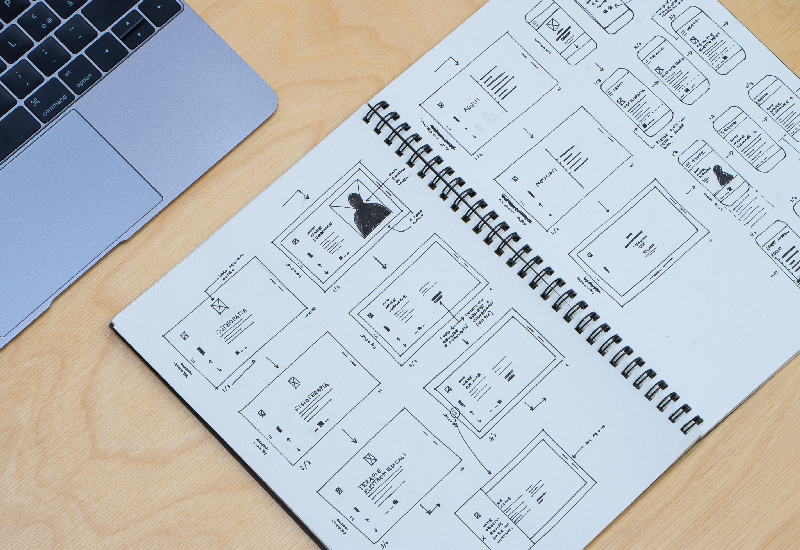
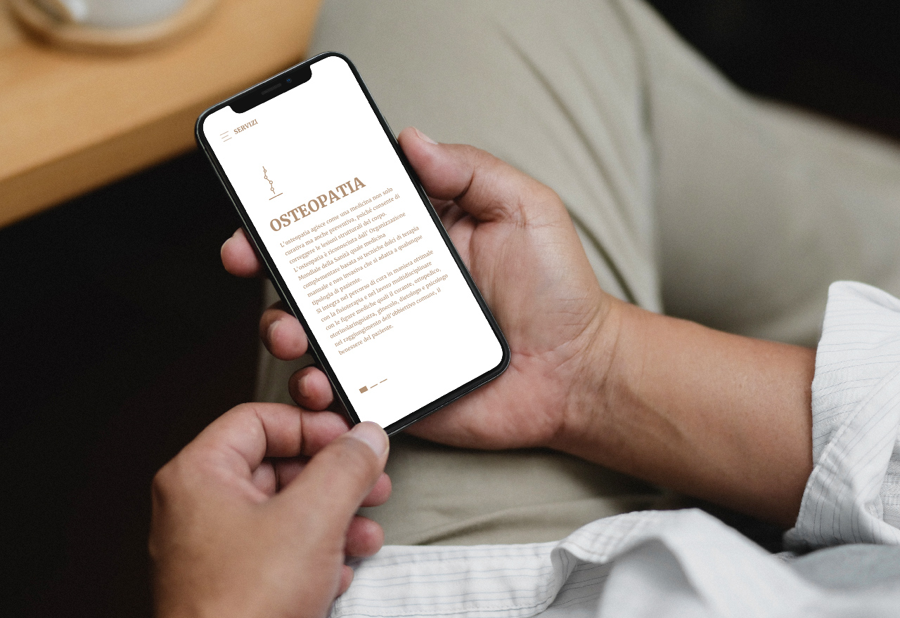
The website, a single-page scroll structure, has three main goals: Reduce contents to the bare essentials. Be as straightforward as possible with patients. Mark a distinct approach to the discipline.

TYPE:
Web design
YEAR:
2016
